01
CSS
Codepen.io
Description
Get that killer Y2K look with JUST CSS! Perfect looping animation that works on any screen size.
Easymode!
Let's jump right in:
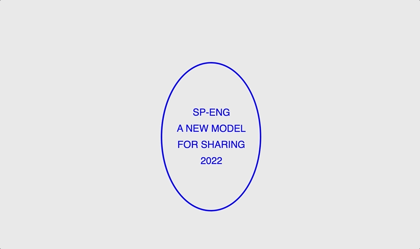
<!--index.html-->
<div class="bg">
<div class = "disc">
	<p>SP-ENG</p>
	<p>A NEW MODEL</p>
	<p>FOR SHARING</p>
	<p>2022</p>
</div>
</div>
Ignoring my awful indentation technique, we have a simple background and a disc inside it. You can put anything in here, but I recommend small bits of text.
.bg{
	background-color: #00000015;
}
div {
	perspective: 500px;
	display: flex;
	justify-content: center;
	flex-direction: column;
	align-items: center;
	height: 100vh;
}

.disc {
	width: 200px;
	height: 300px;
	border-radius: 100%;
	background: transparent;
	border: 3px solid blue;
	color: blue;
	font-size: 20px;
	transform: rotateY(0deg);
	animation: rotateAnimation 5s linear infinite;
}
p{
	margin-block: 0px;
	margin-top: 5px;
	margin-bottom: 5px;
}

@keyframes rotateAnimation {
	0% {transform: rotateY(0deg) rotateZ(0deg);}
	50% {transform: rotateY(180deg) rotateZ(5deg);}
	100% {transform: rotateY(360deg) rotateZ(0deg);}
}
The CSS does all the heavy lifting here. We start by putting all divs on flex mode, centering all of their children. This just makes the demo easier to make, but I wouldn't do this in production.
The disc itself has a fixed width and height. You could swap these for vw units for a more responsive vibe but I'm opting to keep it small on all screen sizes. Give it a border of your choosing and match it to the text color for maximum y2k-ness.
The core animation is rotateAnimation, split into 3 keyframes, 0deg, 180deg, and 360deg around the Y axis. To spice things up, add a rotateZ in the at the 50% mark.
👨💻 with ❤️ by spiritual.engineering