04
CSS
codepen.io
Description
Pure CSS goodness! Achieve that ink-bleed style effect with just some CSS filters.
WOOO
Ever wanted to get that print feel on a web page? Now you can (with some caveats).
The demo I've linked here has a lot of flex layout stuff going on, which I won't be getting into today. The main effect I want to highlight is the blur.
The main structure of this document is as follows:
<div class="overlay two"></div>
<div class="overlay"></div>
<main>
  <div class="design">
    <!-- actual design goes here -->
  </div>
</main>
Pretty straightforward. Since this effect is powered by CSS filters, you can put any kind of content (images, svg, text) in the design div and still get cool results.
Let's start with the styling for the design div, which I've included below. The important parts to note are the background gradient, filter, and hover state.
.design{
  display: flex;
  justify-content: center;
  align-items:center;
  position: relative;
  filter: blur(3px);
  background: linear-gradient(129deg, #fff 0%, #c7c7c7 100%);
  transition: filter 0.3s ease-in-out;
  &:hover{
    filter: blur(1px);
  }
}
I've written this example in SCSS to make nesting easier, but the same effect can be done with a few extra lines of CSS.
With this code alone, you have just some blurry content. We can use CSS filters to "sharpen" the blur and get a nice ink-bleed effect if we edit the styling for the <main> tag.
main{
  background-color: white;
  z-index: 1;
  width: 100vw;
  min-height: 100vh;
  display: flex;
  justify-content: center;
  align-items:center;
  filter: contrast(8);
}
The important part is this last line, filter: contrast(8). Think of it as applying a threshold filter to blurred text in photoshop (or just cranking up the contrast). Since the <main> tag is surrounding the blurred <div>, the filters stack just like photoshop filters.
The only caveat to this effect is we can't really edit colors efficiently, since the contrast filter will deep-fry whatever color choices we make. I've decided to (somewhat) fix this issue by adding overlay <div>'s to the document.
Here's the CSS for mine:
.overlay{
position:fixed;
width: 100vw;
height: 100vh;
background-color: green;
opacity: 0.9;
mix-blend-mode: multiply; //make the lighter colors more green
z-index: 10;
pointer-events: none;
&.two{
background-color: red;
opacity: 0.95;
mix-blend-mode: lighten; //make the darker colors more red
z-index: 11;
}
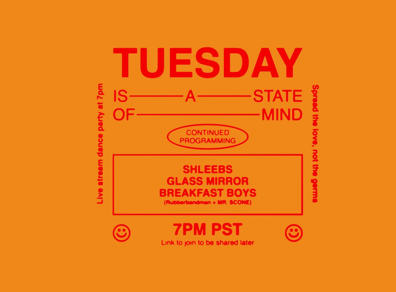
}The end result is a vibrant yellow and red color palette.
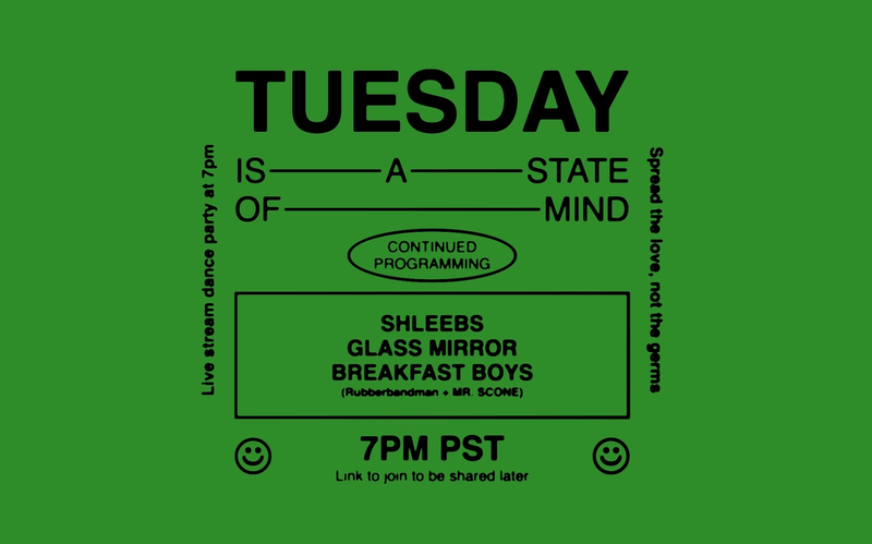
If we just wanted to change the background color, we can simply comment out the second overlay, to get an effect like this:
That's all for now, folks. Happy stealing.
👨💻 with ❤️ by spiritual.engineering